
Wedding colors can shape much more than the look of a ceremony. They affect how a room feels, how guests respond to the setting and even how memorable the celebration becomes. That makes the color palette worth considering alongside the dress, flowers, invitations and reception decor.
Color psychology expert Michelle Lewis says couples should pay attention to the emotional effect of their chosen shades rather than selecting colors only because they photograph well. Lewis is a certified color analyst, author and founder of ColorAnalysis.com and The Color Institute. She is also the author of "Color Secrets: Learning The One Universal Language We Were Never Taught."
According to Lewis, wedding colors can influence the emotional atmosphere from the first arrival to the final dance. Color can affect heart rate, stress responses and neurological reactions, sometimes without guests consciously noticing the effect.
That does not mean every wedding needs bright or dramatic colors. Instead, Lewis recommends creating a palette that connects the couple and wedding party’s personal coloring, the intended mood and the physical setting.
Why All-Neutral Weddings Can Feel Flat
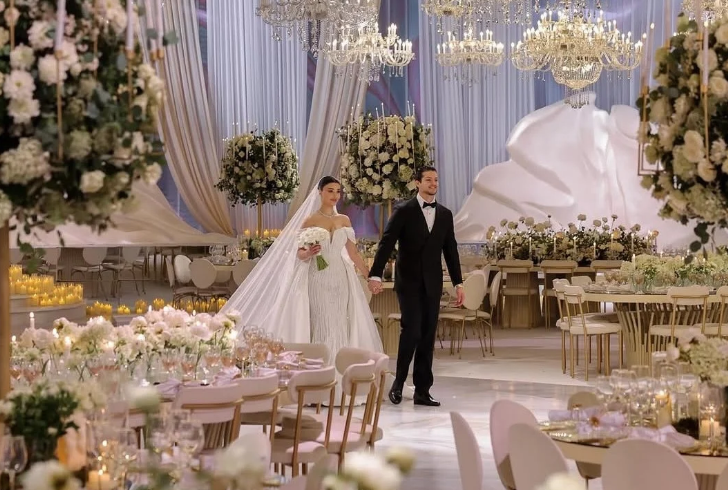
Instagram | dwp_congress | Neutral wedding palettes stay popular for their clean, versatile, and camera-ready look.
The “sad beige” wedding trend has remained popular because it offers a clean, polished appearance. Ivory, cream, taupe, greige, champagne and linen shades can create beautiful photographs and work well with many styles.
Lewis, however, sees a problem when nearly every part of the wedding uses the same low-saturation neutral family.
She describes the trend as an aesthetic built around safety and minimalism. While that approach can look refined, it may not communicate the energy associated with a celebration.
“Sad beige” became a common description for weddings dominated by neutral and monochromatic shades. The appeal is easy to understand: neutral colors are flexible, soft and unlikely to clash with the venue. They can also make floral arrangements, table settings and formalwear appear cohesive.
The issue comes when there is little chromatic color to create visual and emotional contrast.
Lewis says neutral and near-neutral environments generally create lower emotional arousal than environments with more noticeable color. She points to a 2025 study that found low-saturation environments tended to produce neutral emotional responses, while moderately saturated warm colors were more often connected with positive emotions.
For a wedding, that distinction matters.
A celebration is expected to create excitement, connection and warmth. If the room relies almost entirely on beige, ivory and gray, the setting may feel calm without feeling particularly festive.
What Gray and Beige May Signal
Gray and beige are not inherently bad wedding colors. Their effect depends on how much of the room they occupy and what other shades surround them.
A light gray wall, cream tablecloth or beige invitation can provide balance. When those shades dominate every major design element, however, the visual environment can become unusually quiet.
Lewis also references a 2025 study involving 15 colors in which light and medium gray produced some of the lowest arousal levels. Warm and more saturated colors generated stronger responses.
The difference may explain why some neutral-heavy weddings look attractive in photographs but feel less energetic in person.
Lewis notes that celebrations involve physiological responses as well as emotions. Joy and social connection can affect the nervous system, while environmental cues can either support or reduce that activation.
A room filled with nearly identical neutrals may therefore create an atmosphere that feels pleasant but restrained.
This does not mean guests will consciously think, “There is too much beige.” Instead, they may simply describe the wedding as calm, understated or less exciting than expected.
Too Much Yellow Can Create Problem
Moving away from beige does not mean covering every surface in bright color.
Yellow can bring optimism, warmth and energy to a wedding palette, but Lewis warns against using highly saturated yellow throughout an entire venue.
“Yellow is the peak excitement the eye experiences as our red and green cones are at their peak sensitivity,” Lewis explains.
That visual intensity helps explain why yellow appears so often on caution signs. The color quickly attracts attention.
Used in smaller doses, yellow can add energy to flowers, stationery, table details or accessories. Used across walls, linens, seating and large installations, saturated yellow can become difficult to process.
Lewis describes excessive bright yellow as potentially overwhelming because the same visual stimulation that makes it lively in an accent can become destabilizing when it fills a room.
The goal is not to replace one extreme with another.
A better approach is to consider the amount of color used, the saturation of each shade, the season, the venue’s natural light, and the colors worn by the wedding party.
A bright shade can work beautifully when it has enough space around it.
How Different Palettes Can Feel
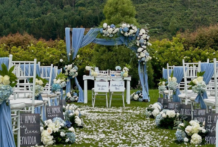
Instagram | rsgroupevent | Beyond aesthetics, color choices like navy and white communicate clear psychological cues like trust and composure.
Color combinations can send different psychological signals to guests. Lewis highlights several examples that show why palette selection involves more than visual preference.
| Wedding Palette | Psychological Signal | Possible Guest Experience |
|---|---|---|
| Oxblood and Navy | Depth, authority, and intensity | Dramatic and memorable |
| Pink, Yellow, and White | Optimism, lightness, and joy | Uplifting and festive |
| Peach, Lavender, and Beige | Soft warmth and calm | Pleasant but quieter |
| Orange, Cobalt, and Pink | Energy and connection | Vibrant and immersive |
| Black and White | Formality and contrast | Striking but emotionally neutral |
| Violet, Tangerine, and Cerulean | Creativity and vitality | Rich and lively |
| Greige | Minimal stimulation | Calm but potentially flat |
| Navy and White | Trust and clarity | Clean and composed |
These combinations are not strict rules. Personal taste still matters. The table simply illustrates how different color relationships can influence the overall impression of a celebration.
Neutrals Can Still Work
Couples who love neutral weddings do not have to abandon the style.
The key is to give neutral shades a supporting role rather than allowing them to become the entire visual story.
1. Make Neutrals the Base
Ivory linens, cream stationery, champagne candles and soft beige details can create a sophisticated foundation.
Lewis suggests allowing chromatic colors to provide the emotional energy. A noticeable accent color can keep the room from feeling visually muted while preserving the clean appearance of a neutral design.
The accent does not need to dominate. It simply needs enough presence to register against the surrounding neutrals.
A sage-green floral arrangement, dusty-rose bridesmaid dresses or warm terracotta details can add contrast without changing the entire wedding concept.
2. Let the Wedding Party Add Color
Wedding party attire offers another practical way to introduce stronger shades.
Because people move throughout the ceremony and reception, their clothing naturally carries color around the room. That makes dresses, ties, suits, accessories and floral pieces useful tools for adding visual variety.
Lewis suggests combinations such as sage green, dusty rose and warm terracotta when a couple wants neutral decor with more emotional warmth.
This method can also create stronger photographs because the moving figures provide color against a quieter background.
3. Use Lighting to Change the Mood
Lighting can make a major difference without requiring new decor.
Lewis points to warm amber, golden and soft pink lighting as options that can introduce a warmer emotional quality into a neutral room.
The effect can become especially useful as the day progresses. A ceremony held in natural daylight can maintain a soft, neutral appearance, while warmer lighting during dinner can make the same space feel more intimate and energetic.
Lewis describes color temperature in lighting as an underused wedding design tool. Adjusting the light can help mark the shift from vows to dinner and eventually to dancing.
Venue Matters as Much as the Palette
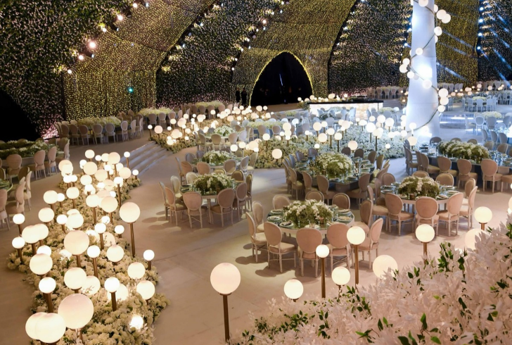
Instagram | bazevents | A wedding color palette’s true appearance shifts based on your venue’s lighting, backdrop, and time of year.
A color that works in one wedding venue may look completely different somewhere else.
Natural daylight, artificial lighting, wall colors, flooring and surrounding architecture can all change how a shade appears. Season also plays a role. A palette that feels fresh in summer may seem heavy or disconnected in winter.
Lewis recommends checking whether the couple’s personal color palette, the celebration’s emotional goal and the venue’s conditions work together.
That three-part approach can prevent a common mistake: choosing colors from a trend board without considering how they will look on actual people or inside the chosen space.
Skin tones also deserve attention. Lewis notes that some monochromatic neutral palettes can be difficult because they do not flatter a broad range of complexions equally.
Wedding party attire should therefore be tested in the venue’s real lighting before final decisions are made.
Balanced Palette Makes More Sense
There is no universal “perfect” wedding color scheme. A formal black-and-white wedding can feel striking, while navy and white can create a composed setting. Brighter combinations can produce more energy, and softer palettes can support a relaxed atmosphere.
The important distinction is between using neutrals intentionally and allowing the entire wedding to become visually neutral by default.
Color does not need to dominate the room to have an effect. One carefully selected accent, colorful attire or a shift in lighting may provide enough contrast to change the atmosphere.
Wedding colors influence how a celebration looks, but they can also affect how the space feels to the people inside it. Michelle Lewis’s color psychology guidance suggests that heavily neutral palettes may create a quieter emotional response, while warm and moderately saturated shades can add energy.
At the same time, brighter colors require restraint. Saturated yellow, for example, can become overwhelming when used across a large space.
The most practical approach is to build the palette around the couple’s style, the intended mood, the people wearing the colors and the venue itself. Neutral shades can remain part of the design, but adding purposeful color through flowers, attire or lighting can help the celebration feel more lively without sacrificing a polished look.